design

  • All Post
  • branding
  • design
  • exhibition
  • interactive media
  • photography
  • printed media
  • research
  • teaching
  • typography
  • Uncategorized
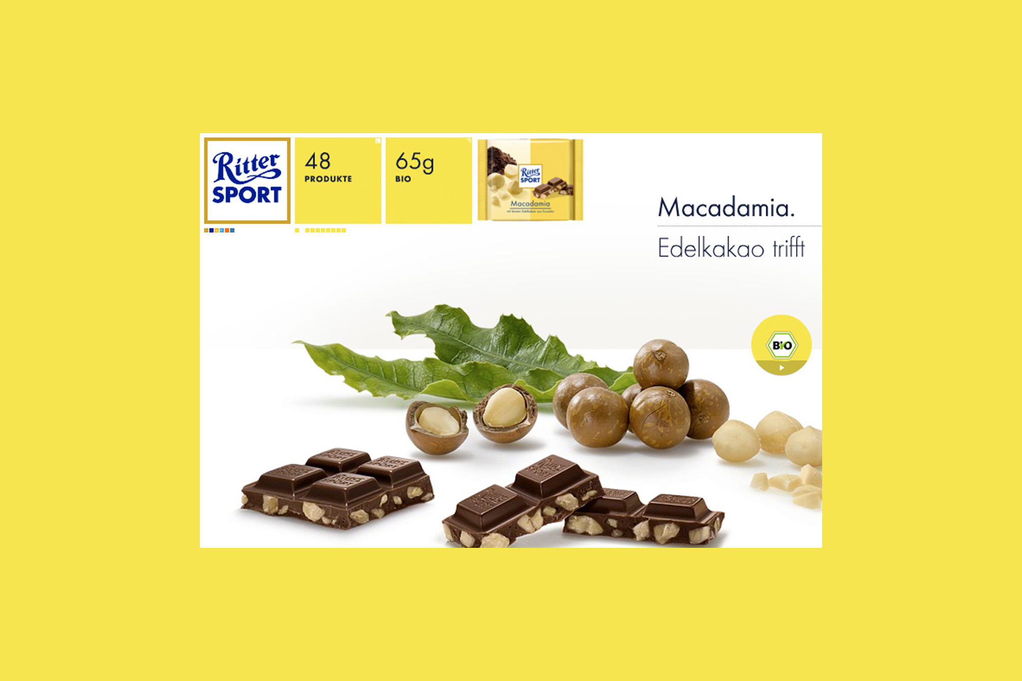
RITTER SPORT Bio

„Mir sind Schwabe, mir könne ned anderscht,“ – this is the Swabian way of saying “We can not help it” and it was Alfred Ritter’s answer to the question why the RITTER SPORT Organic Chocolate is made with such great effort, perfection and attention to...

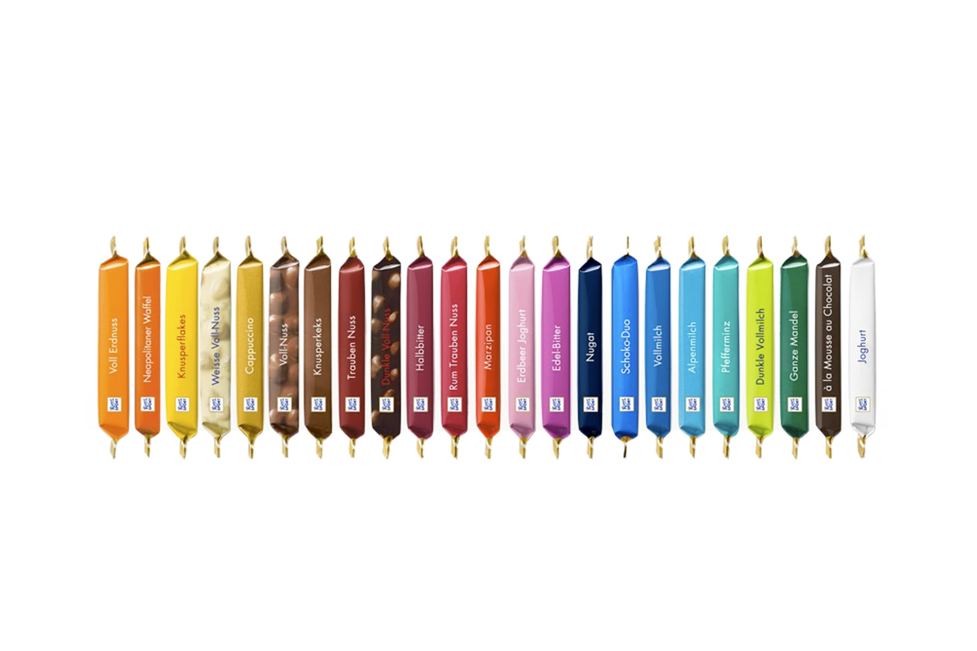
RITTER SPORT

Why is the RITTER SPORT chocolate a square? Because it fits better in the pocket of a sports jacket without breaking and still has the same weight as a conventional bar. This was Clara Ritter’s pioneering idea in 1932, profitable also because the new factory...

The Kitchen Art Space…

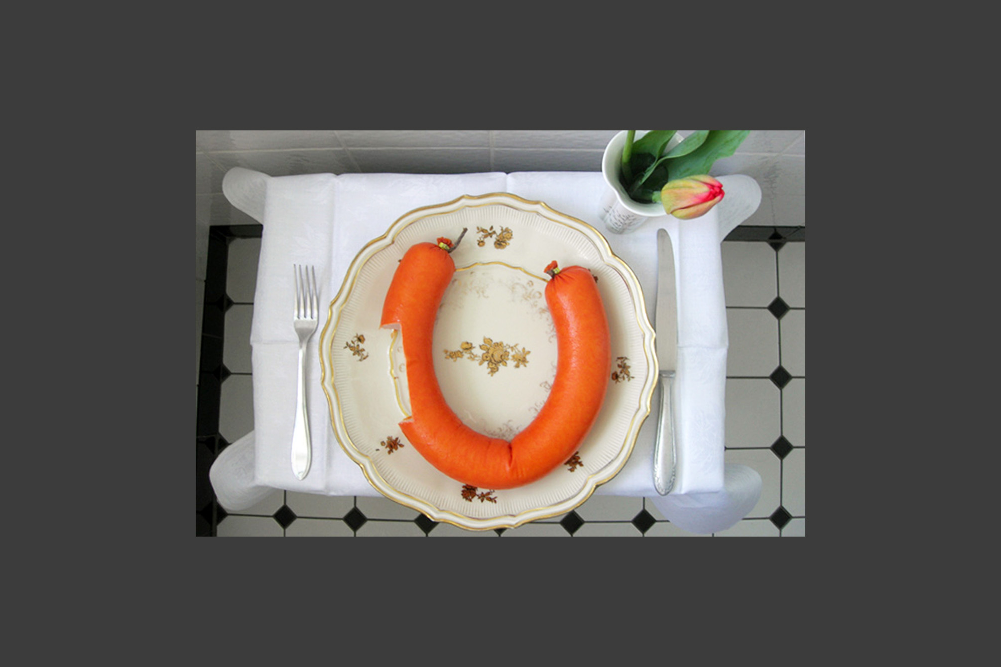
… was an interactive art and event series with regular “happenings”. They usually took place in a kitchen in Hamburg and the visitors were part of the concept. They either brought the art with them or created it on site. This concept opened a creative...

Aspirin

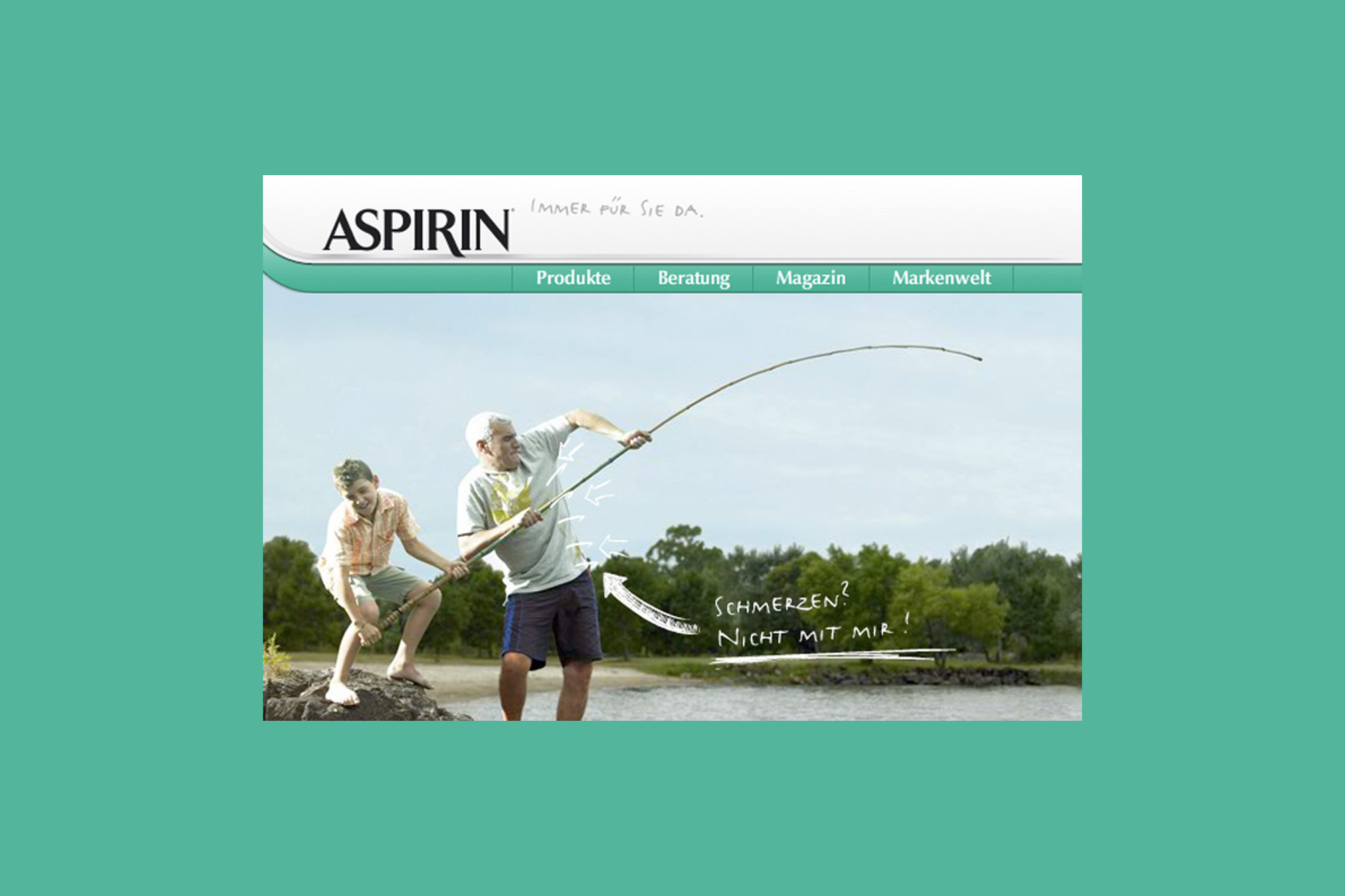
Pain? No way! There is a solution for every kind of pain, as well as for outdated design: after the Aspirin product packaging has been renewed, the website was adapted and modernised. Accompanying the packaging relaunch of the aspirin products, the German brand website was...

Urban Interface | Berlin

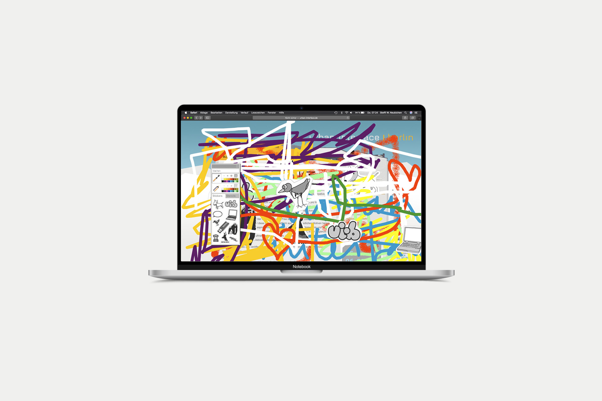
Urban Interface is an art project that deals with the “changing understanding of the public and private space”. After a first run in Berlin, it also took place in Oslo. The website introduces the artists and their projects. It also documents all processes and over...

8 x 4

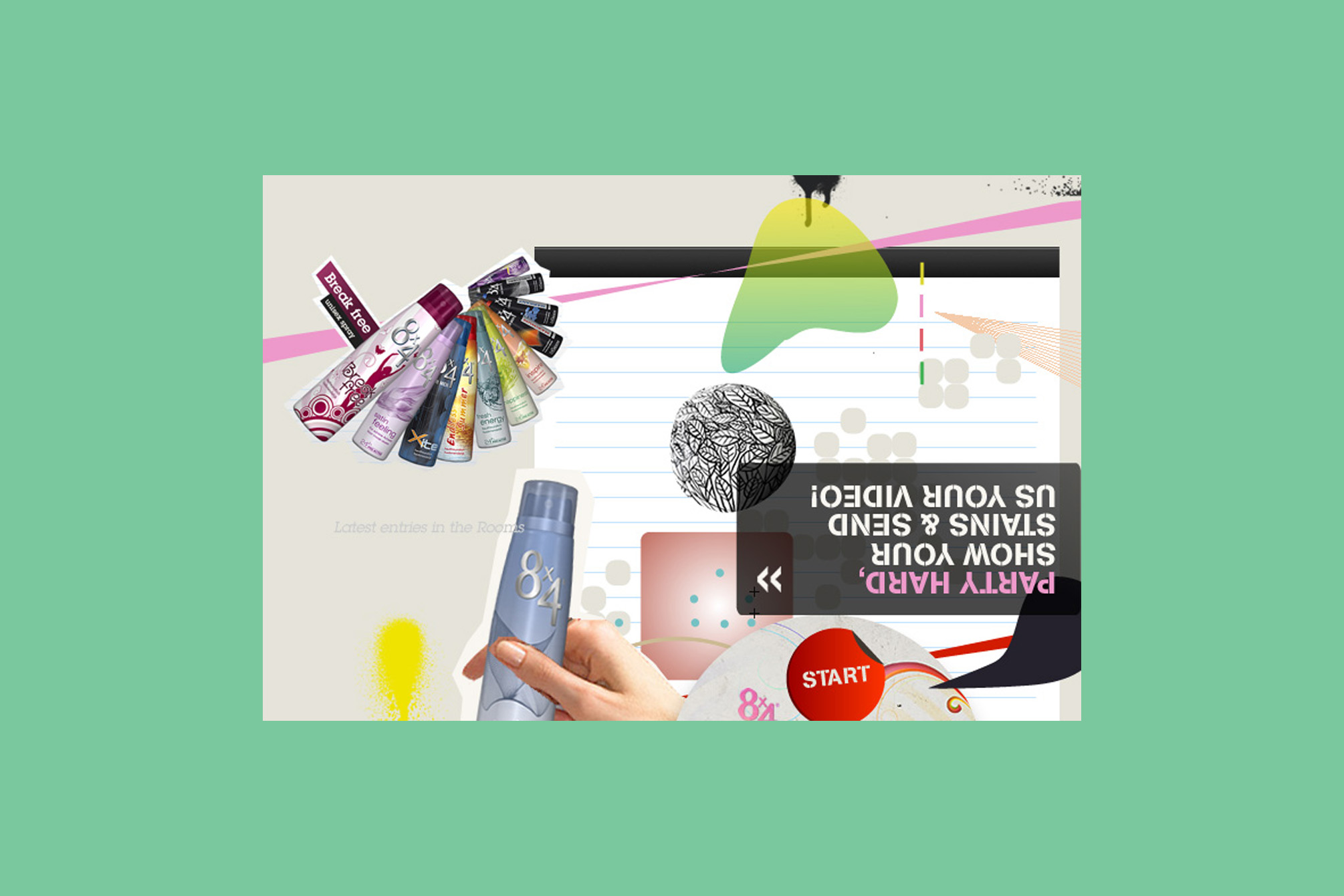
Sweat Yourself – People sweat when they have fun! We wanted young people to document this fun, to allow them to have a more relaxed relationship with their bodies. New packaging, new claim “Live your Style”, new website. Our task was to find a new...

NIVEA 6.0

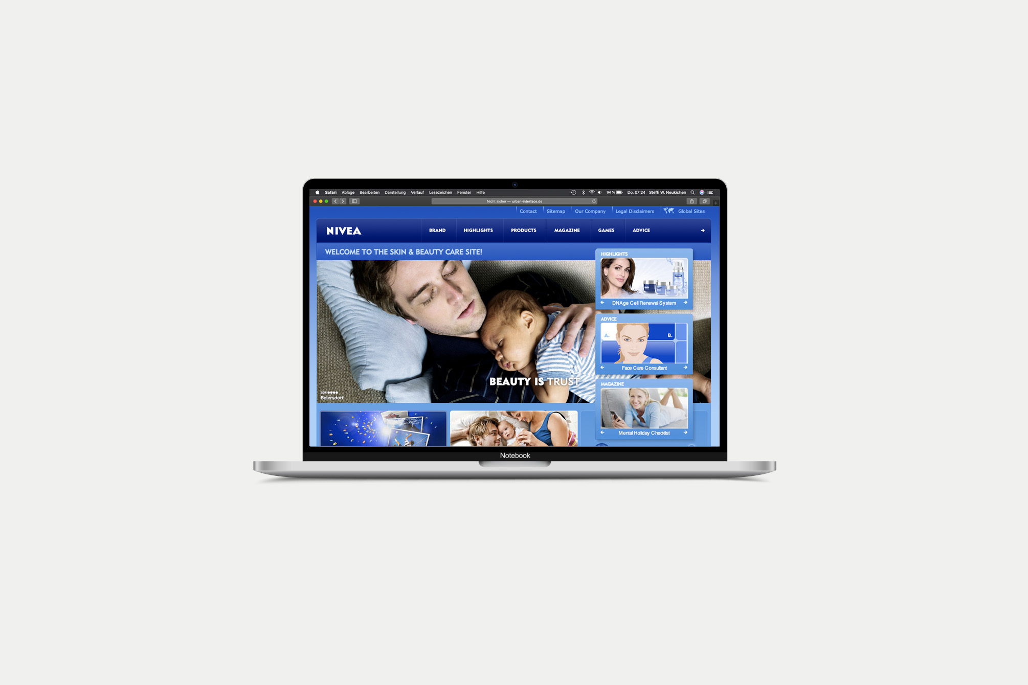
The new, international NIVEA website was supposed to be more “cosmetic” and emotional. At the same time, the new umbrella brand strategy “Beauty is…” was developed, which was integrated alongside a comprehensive history area. The result was a design with many curves and smooth transitions,...

evian

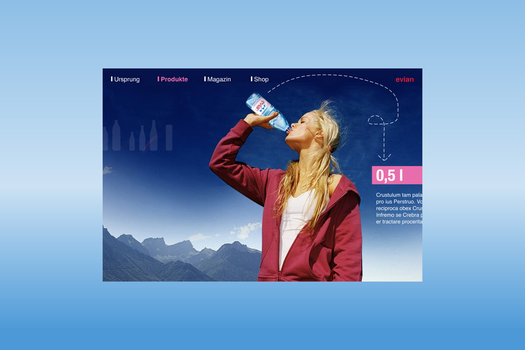
“evian – I am what I drink” was a very nice pitch project: The brand was supposed to get a new and modern look. The focus was on the origin and purity of Evian water and a lot of information about the meaning of “drinking...

Futuro

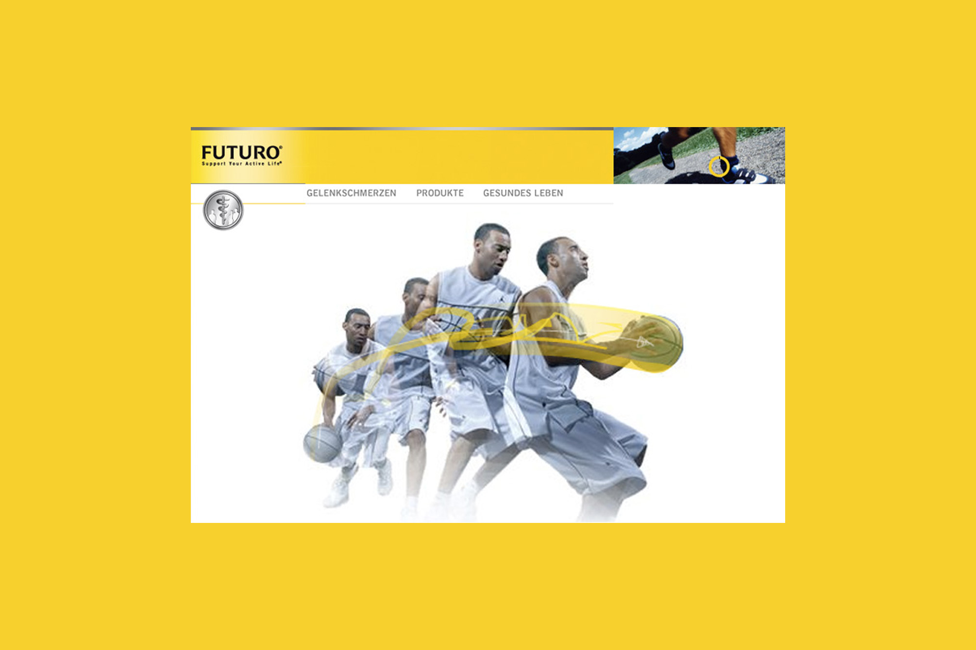
If you have always been interested in taking a look under the skin, FUTURO was the right place for you. Almost every joint was shown in 3D, rotatable and all muscle layers and tendons could be switched on and off so that an anatomical detailed...

Jörg Löhr success training

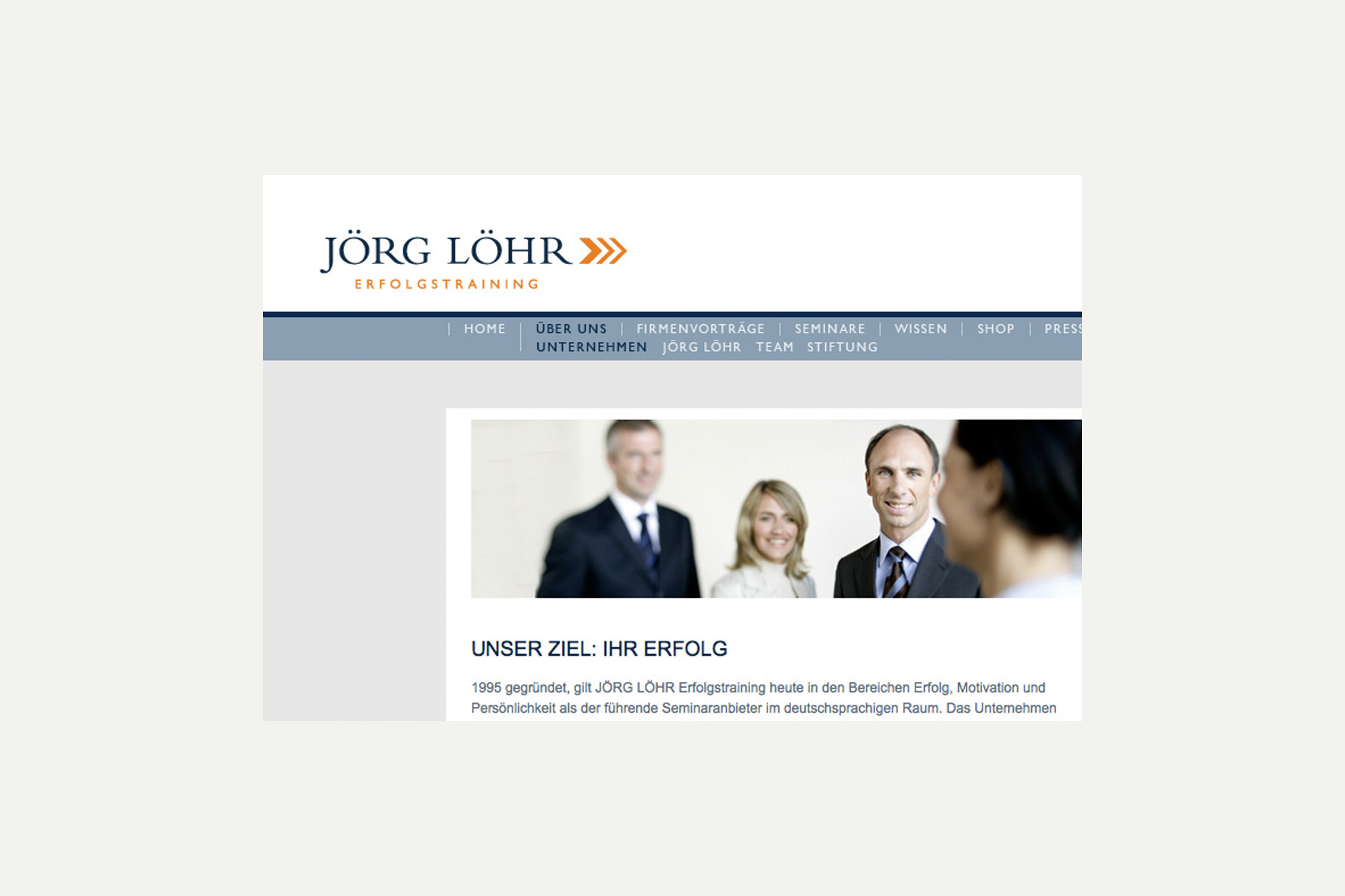
Clarity and respectability were the focal points for the development of the new corporate design – logo, stationary and seminar materials. The website presents the personality and success trainer, his seminars can be booked online.  The website comes with a broad chapter within which current...

Load More

End of Content.

PROF. STEFFI W. NEUKIRCHEN

Facilitating change by questioning, observing,
collecting, making and encouraging – deeply human

© 2026 Created with Royal Elementor Addons and loads of love